 VIEW PROJECT
Client:
Newsday
Summary
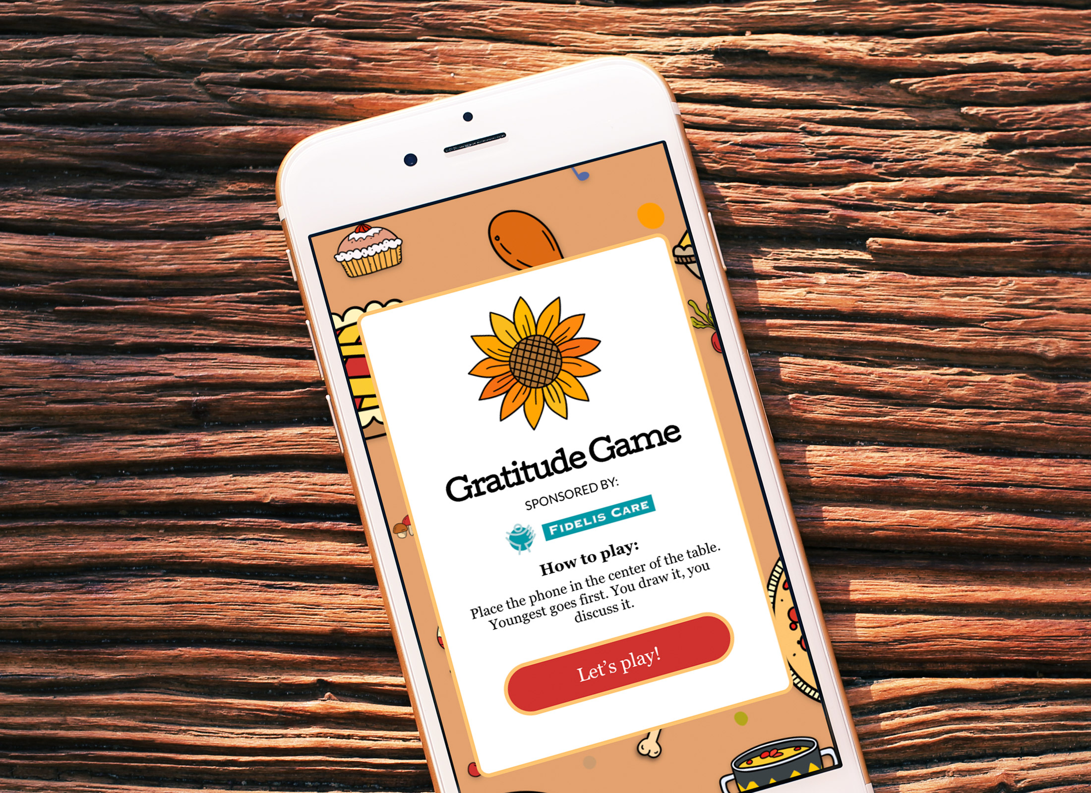
A member of the editorial staff came to me asking if we could do something fun for Thanksgiving. Due to COVID-19 getting together with family members was going to be tough, so we wanted to create a fun thing to do that helped stimulate positive conversation about 2020. She had a great idea to create an online card game that users could put on their table and toggle through a set of questions as a conversation starter.
Product Viability
To start we would need to see if this product was a viable idea. Would people use something like this? Since the design I had in mind was super simple, I had one of my designers work up a quick mock of what the game might look like on mobile. We staged the prototype in Invision with a couple different variants on how it may look. We then queued up a quick product viability study in Usertesting.com.
We asked some basic questions about the design to ensure users found value in the product and to get first impressions. We screened participants to ensure we were getting folks who visit Newsday and live on Long Island (Newsday’s primary target demographic).
Objective
What are participants’ impressions of an experience after interacting with it for the first time?
Sample Questions
1. State 3 words to describe how the game makes you feel.
2. In your own words, describe what this page offers.
3. Knowing what this page offers is this something you would use?
The test contained a bunch more questions to gauge the initial impressions and gave us a good set of answers. 15 out of 15 respondents found the page visually appealing and said it was something they would use. With those questions answered, we moved forward with the project.
Content Generation and Design
Now that we knew the product was something people would use we proceeded with next steps. The editorial representative started to generate the questions that would be needed for each of the “cards”. We discussed the design options as a group and came to a collaborative decision on which design we all liked the best and felt was representative of the content. My UX designer tweaked the designs with assistance from my front end developers to ensure a streamlined development cycle. Once the designs were ironed out and approved by all the stake holders we started developing the game.
Development
Since I come from a development background my involvement in this cycle is fairly hands on in some cases. Since my team was light due to holiday vacations, this was one of the times I had to get my coding chops back into the fray. My lead developer did most of the work by setting up all the HTML and CSS using our established grunt shell which optimizes all the CSS code minifying the SCSS files into a small file for best performance. Once the full HTML and CSS was done the development team proceeded to create a React framework to show each card randomly when the user hit the button. Some last miniute suggestions came through and I quickly modified some of the code base to compensate. Once everything was working properly we assigned the product to QA.
Quality Assurance
Overseeing the QA portion of the product is always one of the most important parts of the product in my opinion. This is where your hard work gets tested, and our QA team at Newsday is best of breed. They test the product on all the major devices and browsers in our most used reports and identify any issues, pain points or device incompatibilities. At Newsday we have a standard issues spreadsheet that is of my own design to ensure all reported issues are addressed. You can view a sample of that spreadsheet here. The spreadsheet was collaboratively constructed and is one of the foundations of our development cycle. Before this spreadsheet team members had to go through bulleted lists on tasks which was not ideal. This allows for a surgical way of identifying the important, edge and second iteration cases.
Launch, Test Iterate
Launch of the product was a success and was well received by our audience bringing in approximately 8k unique visitors in the day of launch. As part of our audit process we take user recordings and heat maps of all the products we launch and do an audit after 10k impressions. This framework has attracted the attention of the newsroom and we are now in the process of refactoring the design for another application. Based on the recordings and heat maps we can make data driven enhancements to ensure the next round of this game will have an improved UX.
VIEW PROJECT