Company:
Newsday Media Group
Summary
At Newsday Media Group, I led the redesign of our digital subscription checkout process to address significant user drop-off rates, which exceeded industry standards. Our goal was to streamline the checkout experience, reduce purchase anxiety, and increase conversion rates.
Design Objectives:
Simplify the Checkout Process: Reduce the number of steps and fields required to complete a digital subscription purchase.
Enhance User Experience: Create a seamless, on-page checkout form that allows users to subscribe without navigating away from their current page.
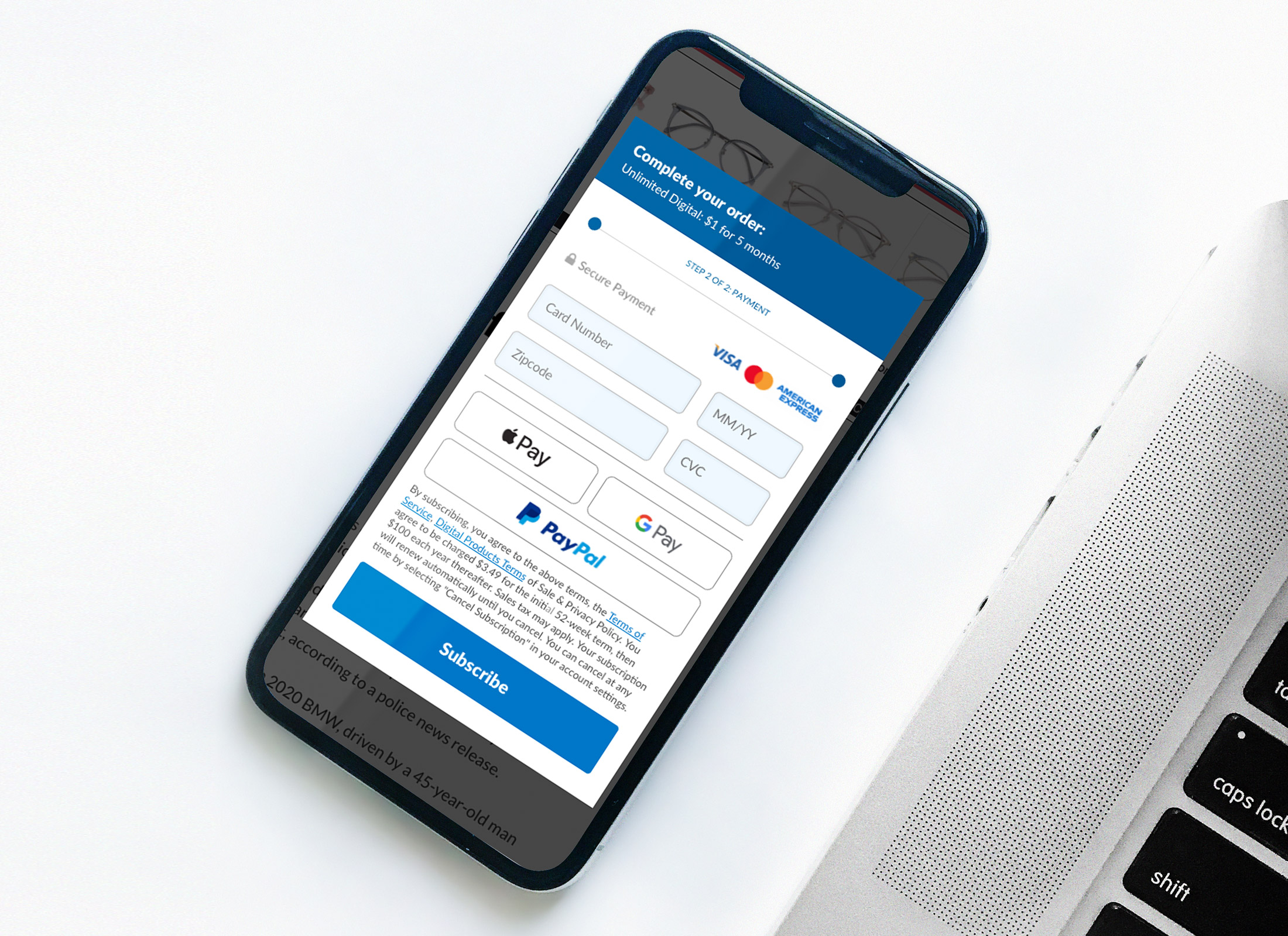
Design Process:
User Testing and Analysis: We conducted qualitative tests where users navigated the purchase flow, articulating their thoughts at each step. This revealed that the existing process was overly complex, with too many required fields leading to user frustration and abandonment.
Information Optimization: We identified the minimal information necessary for a digital subscription: name, email, and credit card details. By eliminating unnecessary fields, such as full address, we streamlined the process, allowing additional information to be collected post-subscription if needed.
Design and Implementation: We developed a two-step, on-page checkout form that enabled users to subscribe directly from the page they were reading. This approach minimized disruptions and kept users engaged with the content they sought.
Key Features:
Minimalist Form Design: The checkout form was condensed to essential fields, reducing user effort and decision fatigue.
On-Page Integration: Users could complete the subscription process without being redirected, maintaining their connection to the content.
Two-Step Process: The simplified, two-step checkout reduced perceived complexity and accelerated the subscription process.
Outcome:
The enhanced checkout design led to a 22.4% increase in completed subscriptions, effectively reducing drop-off rates and boosting digital revenue. By focusing on user-centric design and minimizing barriers to entry, we created a more efficient and enjoyable subscription experience.